Are You Guilty of Committing One of the Top 7 Deadly Sins of Interior Design?
Are You Guilty of Committing One of the Top 7 Deadly Sins of Interior Design?
 Although there are probably as many opinions as there are interior designers in this world, for me there are seven areas that are key for making any space succeed and be truly well designed. I like to think that not taking these areas into account is akin to committing a Deadly Sin of Interior Design. For those of you that were not raised with the Catholic concept of the 7 deadly sins, excuse the dramatics. But for those of you that know what I’m talking about you’ll be able to relate.
These are My Top 7 Deadly Sins of Interior Design:
1) Lack of focal point
2) Lack of cohesive concept or theme
3) Poor Space Planning
4) Bad color scheme
5) Poor Lighting Scheme or not Energy Efficient lighting
6) Unsafe work environment
7) Inaccessible design
Now that you know what these sins are, don’t you want to know more about how to absolve them? Well that’s what I’m here for.
This will be the first in a series of seven articles that will give you tips on things you can do in your home or small business for little or no money, that will help address each of these areas.
#1 LACK OF FOCAL POINT
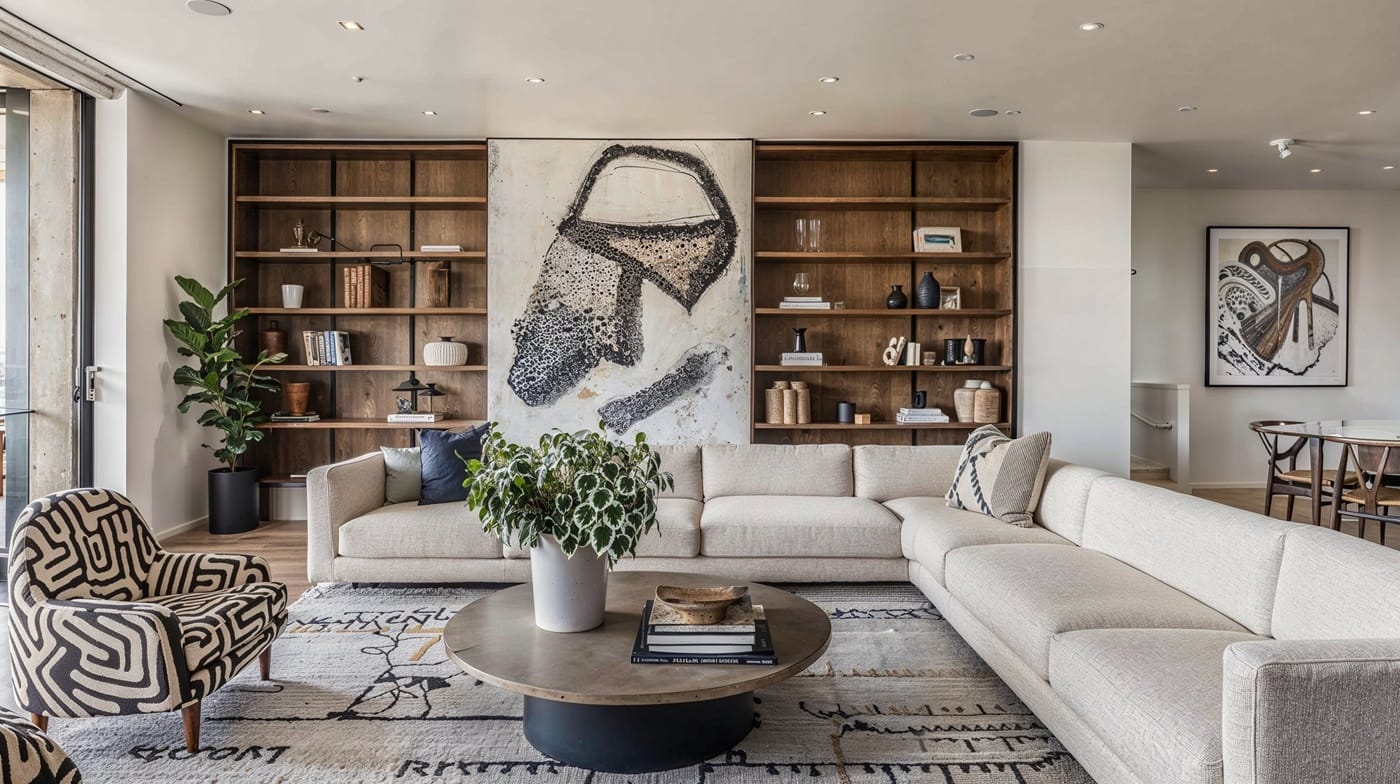
What is a focal point? Basically it is as it sounds, an area that will attract interest and attention into a room.
Why should we care? Without a clear focal point people may not know where to go, where to look, and where to go to get what they need. Think about it, when you are entering a building you have never been into before, how do you know where to go? You usually look for a reception desk, or an area that says “look at me!” “You are Here, Inc.” and then you can go from there, or find someone to ask where to go.
How can we create it with little or no money? Although there are many ways to create a focal point which can be costly (changing the architecture, adding focal lighting, textures, etc.), one of the easiest and most affordable ways to create a focal point is with color. Select a color that has impact, is bright or has high contrast with the rest of the color in the space. Buy a gallon of paint (more if you have a very large wall, or are trying to use a dark color that may need multiple coats), and paint the wall that you want to highlight. On a business, often times this is the wall where you find the name and logo of the company, or the wall behind a reception desk. Once you do this, make sure that there are no other areas that are fighting for attention, and that it is clear as you come into the space what is the most important area you want people to concentrate on. Although it is possible to have more than one focal point in the same common area, it is always best to keep it simple and stick to just one. You can then create other focal points in other areas of your business office, as deemed necessary to again tell others where to go, and what is the function of each area.
So there you have it, sounds easy enough? Hope so. Any thoughts or questions you would like to share about it please do not hesitate to contact me. Stay tuned for next month when we’ll tackle the next deadly sin, “lack of cohesive concept”, otherwise known as, “Who am I anyway?”


